
Base Rates and Survivorship: Two Reasons a Convincing Story Can Mislead You
Rare events produce mostly false alarms even from a good screen, and studying only the winners hides what the losers did too. Both are failures to ask: how common is this, and who is missing?
Synthetic dataExamples on this page use synthetic data created for illustration.
On this page
Two mistakes produce a surprising number of confident, wrong conclusions. In the first, a rare event is predicted by a test that sounds accurate, and almost every alarm is false. In the second, only the survivors of a process are examined, so whatever they have in common looks like the cause of their success. Both come from skipping one of two questions: how common is this in the first place, and who is missing from my data?
Mistake one: ignoring the base rate
Suppose a screen is built to flag items that are about to “break out” (sell far more than before). Real breakouts are uncommon: 2% of items. The screen is good by any ordinary standard: it catches 80% of real breakouts, and wrongly flags only 10% of ordinary items. A flagged item: how likely is it to be a real breakout?
Most people answer “about 80%”. The right answer comes from counting people, not probabilities (Gerd Gigerenzer calls these natural frequencies). Take 1,000 items:
- 20 are real breakouts (2%). The screen catches 80% of them: 16.
- 980 are ordinary. The screen wrongly flags 10% of them: 98.
- In total the screen flags 16 + 98 = 114 items.
Of the 114 flagged items, only 16 are real. That is 14%, not 80%.
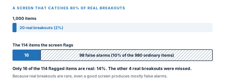
The screen is not bad. The base rate (2%) is low, so even a small false-alarm rate on the huge ordinary group outnumbers the true catches on the small real group. Change the base rate and the answer changes, although the screen itself stays exactly the same (it catches 80% of real breakouts and wrongly flags 10% of ordinary items):
| Share of items that are real breakouts | Share of flagged items that are real |
|---|---|
| 0.5% | 3.9% |
| 2% (the example above) | 14.0% |
| 10% | 47.1% |
| 30% | 77.4% |
| 50% | 88.9% |
The same detector is nearly useless on a rare event and quite good on a common one. A claim like “our screen is 80% accurate” therefore means little until the base rate is stated, and a screen that was validated on a balanced sample will disappoint when it is turned loose on the real, much rarer population.
What to do: always ask “how common is the thing being detected?” before judging a detector. Report precision (the share of flags that are real) as well as the catch rate (Precision and Recall), and expect low precision for rare events. See also Base Rate.
Mistake two: studying only the survivors
During the Second World War, analysts mapped the bullet holes on bomber aircraft that returned from missions. The holes clustered on the wings and fuselage. The first instinct was to add armour where the holes were. The statistician Abraham Wald pointed out the flaw: the data came only from planes that survived. Planes hit in the engines did not come back, so engine hits were missing from the sample. The armour belonged where the returning planes had no holes.
The same structure appears in business data:
| What you look at | What you conclude | What is missing |
|---|---|---|
| The 50 companies that are still large today | Their founders shared trait X | The thousands that also had trait X and failed |
| Products that are on sale now | Short product pages are common among good products | Discontinued products, which may have had the same pages |
| Funds still open after five years | Average return of 6.0% | Funds that closed, which dragged the true average down |
Wherever the failures are removed from view, the survivors look healthier, safer and better than the full group was (Survivorship Bias). Whatever traits the survivors share may be shared by the failures too: you cannot tell without looking at them.
What to do: keep the exits. A list of tracked items should record when an item leaves and why, and the analysis should include them, flagged (Attrition Bias). Ask of every dataset “how did these rows get here, and who is not in it?” (Selection Bias).
The two mistakes together
They often arrive together. A study of “products that broke out” (the survivors of a selection) finds that most had feature X. Without the base rate (how many ordinary products also have feature X?) and without the non-breakouts, the finding says nothing. A fair comparison needs both groups and both rates:
| Group | Number | With feature X | Share with X |
|---|---|---|---|
| Breakouts | 20 | 16 | 80% |
| Ordinary items | 980 | 784 | 80% |
Feature X is common among breakouts, and just as common among everything else. Its presence cannot flag a breakout, yet a study of only the breakouts would announce it as the secret.
A short checklist
- How common is the event in the whole group? Write the base rate down before looking at any test result.
- Convert percentages to counts of 1,000 items. If the numbers surprise you, trust the counts.
- Who is in the dataset, and who left it? Are the leavers kept, with a reason?
- Is the comparison group (the failures, the ordinary items) shown next to the winners?
- Would the pattern still be there if you picked the winners at random?
References
- Maya Bar-Hillel. The Base-rate Fallacy in Probability Judgments . Acta Psychologica, 1980. DOI: 10.1016/0001-6918(80)90046-3
- Gerd Gigerenzer, Ulrich Hoffrage. How to Improve Bayesian Reasoning Without Instruction: Frequency Formats . Psychological Review, 1995. DOI: 10.1037/0033-295X.102.4.684
- Marc Mangel, Francisco J. Samaniego. Abraham Wald's Work on Aircraft Survivability . Journal of the American Statistical Association, 1984. DOI: 10.1080/01621459.1984.10478038